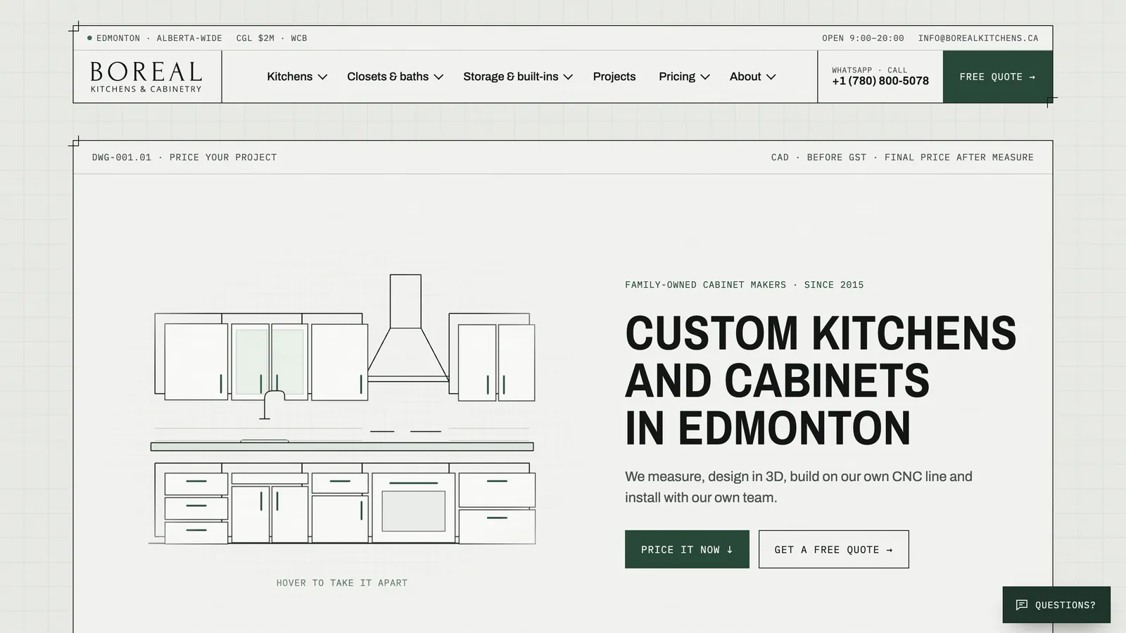
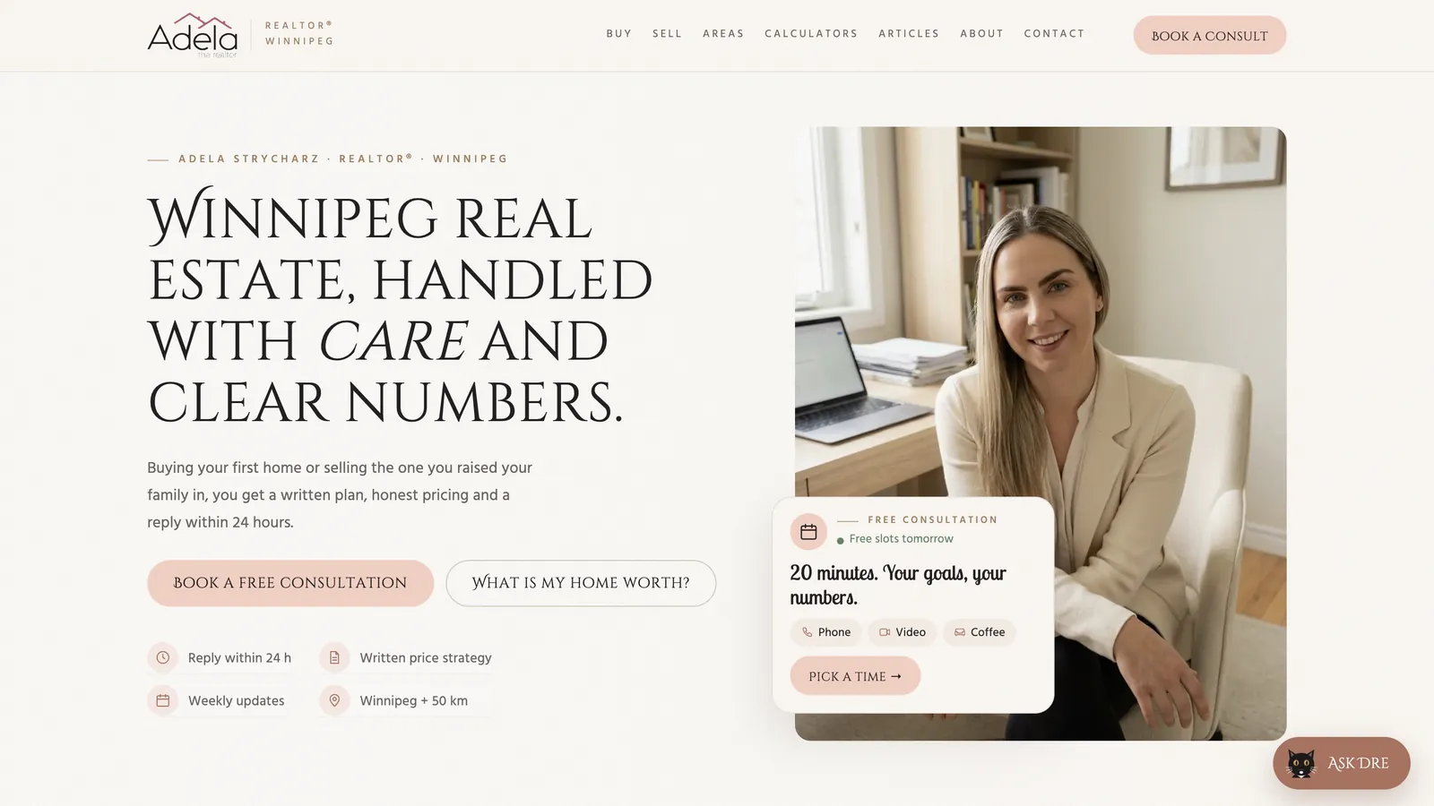


Mobile-first website design
Mobile-first website design means planning every page for a phone before a desktop. Why it matters for local businesses and a ten-point check for your own site.

Mobile-first website design means planning each page for a small phone screen first and only then expanding it for tablets and desktops. It is the opposite of the old habit of designing a large desktop page and squeezing it down. For local businesses the reason is simple: many of your customers find you, compare you and call you from a phone, often in a hurry, often outdoors, often with one hand.
Google also looks at the mobile version of your site first when it decides how to index and rank it, a practice it calls mobile-first indexing. So a site that works well on desktop but poorly on a phone is weaker both for customers and for search.
How customers actually use your site on a phone
Picture the real moments. A homeowner in Winnipeg whose furnace stops in January, searching from the basement. A parent in a parking lot looking for a dentist open on Saturday. Someone on the bus comparing three cleaning companies. They share a few things:
- Little patience. If the page is slow or confusing, they go back and tap the next result.
- One thumb. Tiny links and buttons close together lead to wrong taps and frustration.
- Short attention. They scan, they do not read. Headlines and buttons do the work.
- They want to act. Call, message, get directions, book. Not read your history.
Designing for these moments first produces a clearer site for everyone, including desktop users.
What changes when you design mobile-first
| Element | Desktop-first habit | Mobile-first approach |
|---|---|---|
| Navigation | Wide menu with many items | Short menu; the main action always visible |
| Headline | Long slogan beside a big image | Short, plain statement of what you do and where |
| Call to action | Button somewhere in the header | Sticky call or message button within thumb reach |
| Images | Large banners and sliders | Fewer, smaller, meaningful photos |
| Text | Long paragraphs in columns | Short paragraphs, lists, clear subheadings |
| Forms | Many fields side by side | Few fields, large inputs, the right keyboard for each |
| Tables | Wide price tables | Stacked cards or simplified rows |
The principle behind all of these: on a small screen there is room for only the important things, which forces you to decide what is important. That discipline helps the desktop version too.
Details that make or break a mobile site
Small details matter more on a phone:
- Tap targets big enough for a thumb, with space between them.
- Phone numbers as links, so a tap starts a call.
- Address linked to maps for businesses with a location.
- Input types that bring up the number pad for phone fields and the email keyboard for email fields.
- Readable text size without zooming, and enough contrast for bright daylight.
- No horizontal scrolling, ever.
- Pop-ups and cookie banners that do not cover the whole screen or the call button.
- Fast loading on mobile data, not just office Wi-Fi.
The last point deserves its own attention. Images, fonts and third-party scripts often weigh far more than the page needs. My article on why your website is slow covers the usual causes.
A ten-point check you can do in five minutes
Take your own phone, switch off Wi-Fi and open your site.
- Can you tell what the business does and where within two seconds?
- Is there a call or message button visible without scrolling?
- Does tapping the phone number start a call?
- Can you read all text without zooming?
- Do menus open and close easily?
- Can you fill in the form with one thumb?
- Does anything stick out past the right edge of the screen?
- Do pop-ups or banners block the content?
- Do photos load reasonably fast?
- Can you find prices, service area and hours in under a minute?
If you fail three or more, mobile is probably costing you enquiries every week.
Canadian conditions make mobile even more important
Some situations are especially Canadian. Contractors and their customers often look things up on job sites or in rural areas where the signal is weak. Winter means people search with cold fingers, standing outside a car that will not start, or from a house with no heat. Newcomers often use a phone as their main or only device. And bilingual sites need a language switch that works well on a small screen, not a tiny flag hidden in a corner. Designing for the phone first covers all of these at once.
Mobile-first does not mean mobile-only
Some customers still prefer a big screen, especially for larger purchases or B2B services. Office managers comparing suppliers, couples planning a renovation in the evening, procurement staff downloading specifications. A mobile-first site expands well for them: more space for photos, side-by-side comparisons, longer explanations. The difference is that the core message and the main action were designed to work on the smallest screen first, and everything else is added on top.
Accessibility and mobile go together
Many accessibility basics overlap with good mobile design: readable text, enough contrast, large tap targets, clear headings, forms with proper labels. If you are an Ontario organization with 50 or more employees, accessibility is also a legal expectation. See AODA and website accessibility for what that involves.
How I build for phones first
Every site I build starts from the phone layout. I write the copy with short screens in mind, plan where the main action sits on each page, and test on real devices before launch, not only in a desktop browser shrunk to phone width. Sites are hand-coded or on a light custom CMS, so pages carry only what they need. You can see examples on Sunline Cleaning and other case studies.
If your current site fails the ten-point check, a new business website starts at $3,000, or a focused landing page from $1,300 (Canadian dollars) if you need something live quickly. Or start smaller: book a free 30-minute consultation and I'll go through your site on a phone with you.
Let’s talk
about your business
Before the call I review your website and ads. After the call you get an action plan and a price range in writing.

12+ years in online marketing, 100+ clients. I build websites, Google Ads and Meta ads campaigns, CRMs and automations for small and mid-sized businesses. About me →
Phones and
your website
What is the difference between responsive and mobile-first design?
Responsive means the layout adapts to different screen sizes. Mobile-first is a way of planning that layout: you design for the phone first, deciding what matters most, and then expand for larger screens. A site can be responsive without being mobile-first, which often results in a desktop design that is merely squeezed onto a phone.
Does Google rank mobile-friendly sites higher?
Google uses the mobile version of a site for indexing and ranking, so problems on mobile can hold the whole site back. Content and relevance still matter most, but between similar pages a better mobile experience helps. The bigger effect is on visitors: a site that is hard to use on a phone loses enquiries.
Should I have a separate mobile site?
Usually not. Separate mobile versions on their own address were common years ago, but they double the maintenance and often show less content. One responsive, mobile-first site that adapts to every screen is simpler for you and clearer for search engines.
Is a mobile app better than a mobile-first website?
For most small businesses, no. Customers rarely install an app to book a plumber or check a menu. A fast mobile-first website with clear buttons does the job without asking anyone to download anything. Apps make sense for frequent repeat use, such as loyalty programs or regular ordering.
How does your site
work on a phone?
Send me the address. I'll go through it on a real phone and send you the problems I find, ordered by how many enquiries they are likely costing you.